









Listen to this story · 6 min
People ask where a piece will go before they ask almost anything else, and the honest answer is that these works fit more rooms than most people assume.
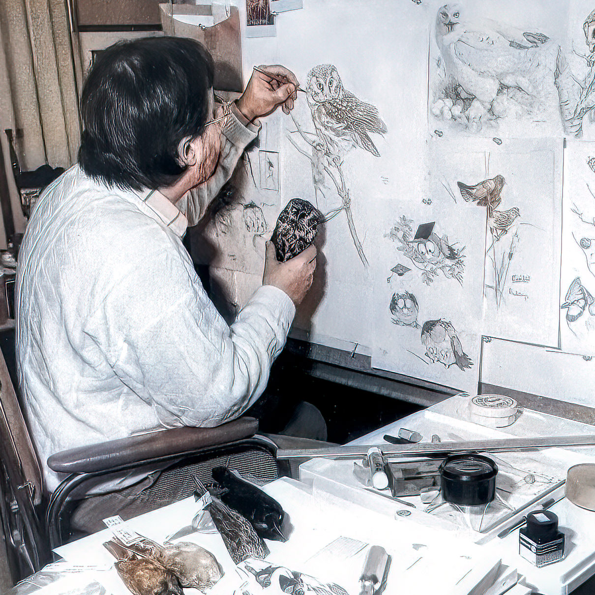
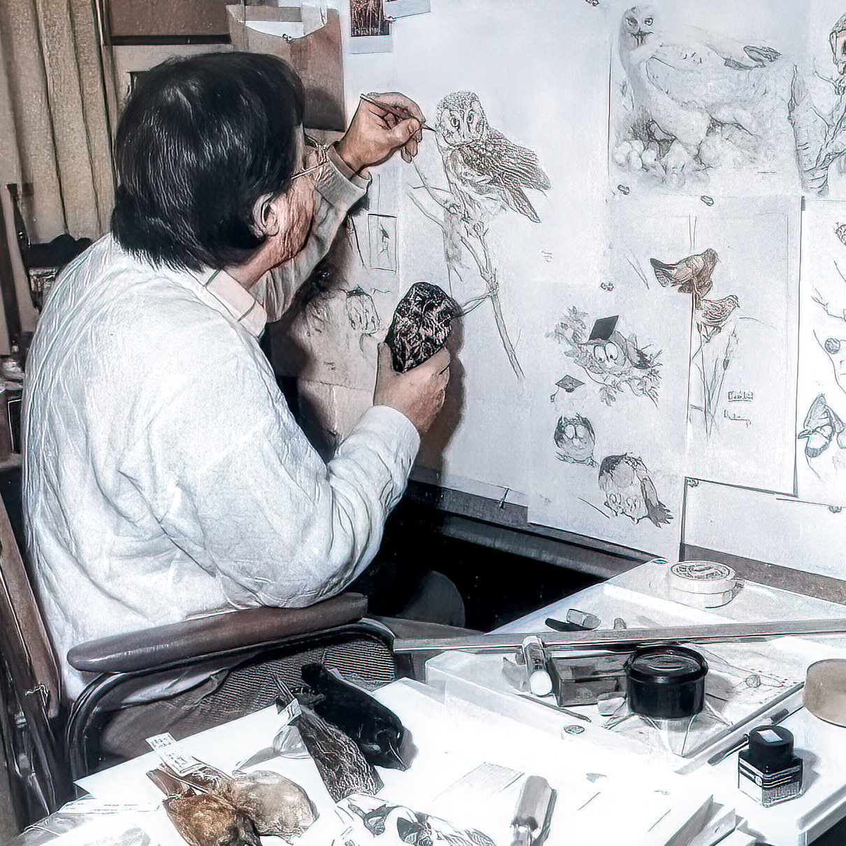
What my father made were studies of individual animals, rendered at close range with the accuracy of a naturalist, most of them on white paper with very little around them. In a room they behave like botanical drawings: quiet, precise, easy to live beside.
But where to put a work is the second question. It is worth being clear about the first.
The animal comes first
Ask a collector why they chose a particular work and they rarely answer in terms of design. They answer with a memory.
Linda Spear chose Queen Anne's Lace:
A lovely depiction of a favorite wildflower. I was married in August 1983 and went out into the fields with my mom to pick this very flower for vases at my reception. I will treasure this.
Betsy Buchanan chose Red Fox and Kits:
We love the print very much. A few years ago, we had a beautiful fox arrive at our home. He appeared faithfully every morning and every evening for his meals. Then Foxy arrived one mid-afternoon and stretched out on the lawn to watch husband Bill work in his garden. It was obvious he was never frightened by us. He gave us many fond memories until one day he disappeared. Our feeling is that he had been taken by the coyotes …so each time we look at the print, it truly brings him back. We want to say a huge "thank you" from both of us to be able to reminisce about our pet Foxy.
Neither of them was buying a picture of a flower or a fox. They were buying a way back into something, and the accuracy is what makes the door open. A generic wildflower would not have served Linda, because it would not have been that flower.
So the usual advice, match the art to the room, is the wrong way round. Choose the animal you cannot stop looking at, or the one that is already attached to something, and then find it a wall. People who choose the other way round tend to stop seeing the work within a month.
Why they suit a plain interior
Most of my father's works sit on an open, undescribed ground. There is a bird, there is the branch it is holding, and then there is paper. That negative space is the reason these works do not fight a modern room. A busy landscape competes with everything around it. A single saw-whet owl on white does not.
The same quality makes them work against strong wall colour. On a deep green or a charcoal wall, a work on pale paper reads almost like a lit window.
Scale
The most common error is going too small. A modest work on a large wall reads as an afterthought.
A reasonable rule: the work, or the group, should occupy somewhere between half and two thirds of the width of whatever it hangs above. Over a three-seat sofa that means something substantial, or several pieces hung as one.
Intimate works reward a different setting. A small study of a field mouse belongs in a hallway, beside a desk, at the turn of a stair, somewhere a person passes at arm's length rather than views from across a room.
Grouping
These works group unusually well, because the body of work is consistent. Three owls from the same period, hung in a row with equal spacing, read as a set rather than a collection of separate decisions.
Other combinations that hold together: a single species across different postures; a botanical group, where the palette does the unifying; or one large work with two smaller studies stacked beside it.
What rarely works is one of everything.
Not everything has to be hung
Anne Gibson has been collecting my father's work for years, and she does something with hers that I had never thought to recommend. Writing about Wild Roses:
This is such a lovely piece. I really like the colours and how it looks in my living room. I have it leaning up against my wall on the mantlepiece. This is one of the main reasons why I love getting canvas prints over regular art prints. I don't have to worry about running out of wall space
Elsewhere she describes leaning one canvas alongside another, and standing them on side tables and staircases rather than hanging them at all.
Her reasoning is better than mine. A work that has sat in one place for two years stops being seen. Moved across the room, it is new again.
The one caution is light. A leaning position often means a bright spot near a window, and direct sun is the single thing most likely to age a work before its time. I wrote about that in Why Some of the Old Ones Faded.
When Anne first mentioned the idea, I replied that it was a good one and that I should pass it on to other collectors. That was five years ago. Consider this the recommendation.
Rooms people overlook
Hallways, because you pass through them slowly and repeatedly. Home offices, where you look up from a screen at something that took weeks of someone's life to make. Bedrooms, where the quietness of these works is an asset rather than a limitation. Dining rooms, where people sit for long enough to actually look.
The room to avoid is the bathroom, for humidity, not taste.
Living with it
The thing that changes over time is not the work but the noticing. You will have it up for a year before you register that the barring on a flank feather resolves properly when you get close, or that the eye is doing something you had not seen.
That is not an accident of hanging. It is what the making was for.
Michael Loates, Owner
Glen Loates R.C.A., Artist


Leave a comment (all fields required)